Online Extras
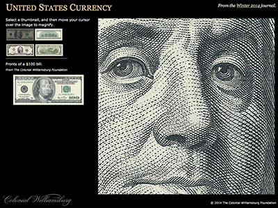
United States Currency
Library of Congress
Paper money was printed by the colonies in the eighteenth century.
Bureau of Engraving and Printing
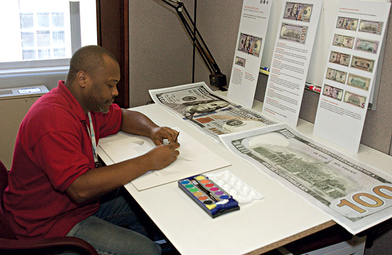
Brian Thompson designed the new $100 bill.
Bureau of Engraving and Printing
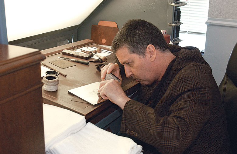
Will Fleishell engraved the $100 bill.
Library of Congress
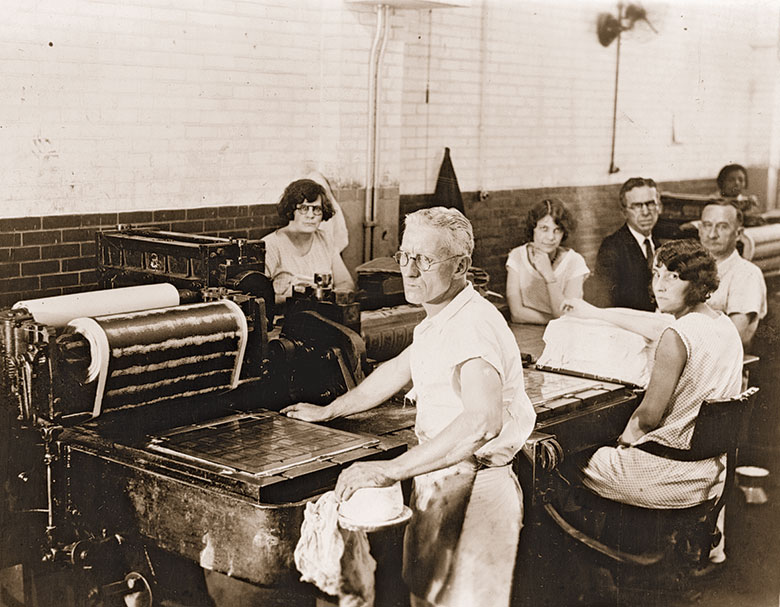
Printers at work in the Bureau of Engraving and Printing in the 1920s.
Billfold-Size Essays in American History
by Gil Klein
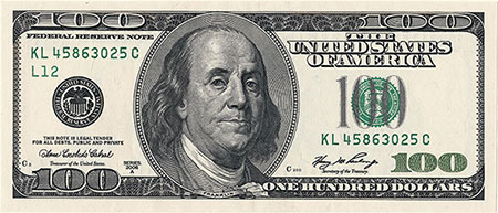
If a person asked a businessman in Tajikistan or Kuala Lampur or Hong Kong to picture a leader of the American Revolution, the image likely to leap to mind is the cool, knowing gaze of Benjamin Franklin, his long hair curling slightly from his balding head past his ears onto his shoulders. It’s a likeness reproduced billions of times and distributed to every nook and cranny of the world. Front and center on the United States’ $100 bill, it is the face of the international currency of choice for business. Franklin’s $100 portrait is so familiar the bills are known world round as Benjamins.
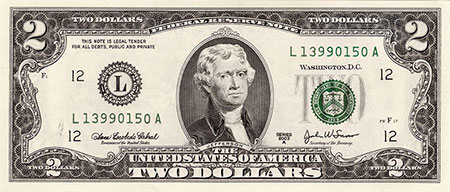
Every piece of American paper money—from George Washington’s dollar bill to Thomas Jefferson’s $2, Abraham Lincoln’s $5, Alexander Hamilton’s $10, Andrew Jackson’s $20, and Ulysses Grant’s $50—is a billfold-size essay in American history and culture distributed far and wide. How those faces got there—who chose which person to be on which bill—is a mystery, even to American currency history scholars.
Let’s start at the beginning.
Paper currency has been around since at least the Song Dynasty in eleventh-century China, though the idea traces to the 600s. Its use by Europeans dates to the 1200s, and the employment of paper promises to pay in place of gold or silver coins came to the New World with them. It is fitting that Franklin’s image graces the $100 bill because, biographer James Srodes says, he was the among the most prominent printers in British America, and colonies asked him to produce their paper money. Today’s bills “are works of art, and they are near impossible to replicate,” Srodes said. “So Franklin would look at the new $100 bill and whistle. He would be absolutely enchanted with the idea that his face was on it.”
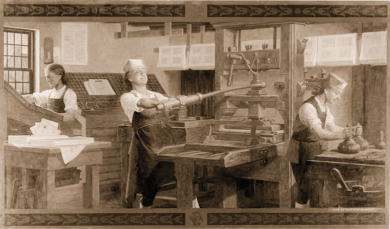
The federal government started issuing paper money during the Civil War. The early bills were larger than today’s and set the standard as works of art and historical lessons, said Franklin Noll, historical consultant at the Bureau of Engraving and Printing. That’s where the currency is designed and printed. “One of the main purposes of the design was educational,” Noll said. “You were dealing with a semiliterate society, and at the time of the Civil War, to create a sense of nation, the idea was you would have these historic portraits. You would have Washington, famous Revolutionary battles, De Soto discovering the Mississippi, the landing of the Pilgrims.”
It probably didn’t hurt Lincoln’s political standing to have his picture on the $10 bill as early as 1861. His secretary of the treasury, Salmon P. Chase—who had his own political ambitions—had his picture on the $1 bill during most of the war. A few years later, in 1866, Congress passed a law banning the image of any living person on federal paper money.
In the mishmash of federal paper money issued throughout the rest of the nineteenth and into the twentieth century, all kinds of historic people and images graced the bills, Noll said. The only image in the history of national bills depicting a historical woman was Martha Washington, who was on the face of the $1 silver certificate in 1886 and 1891. All these bills were so large that they were known as “horse blankets.” Not until the creation of the Federal Reserve System in 1914 did the government begin to standardize the look of the money.
The big change came in 1928. That year the Federal Reserve began issuing notes that would be familiar to people today. The images on the currency have not changed since—Washington, Jefferson, Lincoln, Hamilton, Jackson, Grant, and Franklin.
Larger denominations—William McKinley on the $500, Grover Cleveland on the $1,000, James Madison on the $5,000, Salmon P. Chase on the $10,000, and Woodrow Wilson on the $100,000—have been phased out.
But why those people?
“Probably a decade before 1928, they were thinking about how they were going to do this big redesign,” Noll said. “There is no real paper trail. There are discussions that go on between the head of the Bureau of Engraving and Printing and the treasurer or the secretary of the treasury or other treasury folks. Someone throws out an idea, and they ponder it for a while. Maybe not this guy. Maybe put him over here. But there was no big committee where they hashed this out. It kind of happened behind closed doors, and there they are.”
And there they stayed, largely unchanged, until the early 1990s, when the Treasury Department ordered the bills redesigned to fight counterfeiting. The people on the obverse side remained the same, but their images could be changed.
To the designers and engravers who work in tradition-obsessed obscurity under high security at the Bureau of Engraving and Printing, the currency redesign era is a golden age to produce artwork that will be admired by more people than the finest work of the Old Masters. Only the one dollar bill is unchanged—largely because no one would be interested in counterfeiting a bill of such small denomination. Moreover, in 2006, a provision slipped into a treasury appropriations act forbade the design’s modification.
For twenty-four years, Brian Thompson, forty-three, has been designing money, and he took the lead on the new $100 bill that was to be released for circulation October 8, 2013. “I definitely consider this a piece of art,” Thompson said as he surveyed a mock-up of the bill. “But it also has to tell a story.”
Thompson’s personal story tells something about how that new Benjamin looks. Reared in a Maryland suburb of the District of Columbia, he attended an art high school known as Suitland Visual. His father worked for the Bureau of Engraving and Printing as a cylinder maker, but following his father to the bureau was not his goal. “I knew I wanted to be an artist,” he said. “I didn’t know I wanted to be a banknote designer.”
In high school, he said, his role models were M. C. Escher and Georgia O’Keefe, who had diametrically opposed styles. Escher, a graphic artist, is known for intricate and complex designs. O’Keefe is known for colors and free-flowing, abstract style. Through his high school years, Thompson said, his teacher homed in on the two artists, giving Thompson the skull of a horse to produce still-life artwork over and over again, wrapping it in different ways to force him to consider diverse approaches to presenting the same subject. By the time he graduated, he said, he was an accomplished, award-winning student artist ready to further his education in New York City, but his father told him about an art job coming open at the bureau. On a whim, young Thompson applied. Who would hire a kid out of high school for such a prestigious job? He got it, and after a seven-year apprenticeship, he was ready to design currency.
“I learned the fundamentals of banknote design,” he said. “First thing we did was lettering. Understanding the typography, the numerals to script. We had to do it by hand. You didn’t do it by computer at all. You learned how Escher learned how to do things. That kind of clicked.” Now, his hand sweeping across the mock-up, he explained how Escher and O’Keefe came together in his design. He has been working on it since 2005.
Certain things had to be included. Franklin’s visage, which comes from a 1778 portrait by the French painter Joseph Duplessis, had to dominate the front. Gone is the oval frame around Franklin’s portrait, adding more of his shoulders and slightly increasing the size of his head, making it more prominent.
“Franklin is pretty much the same, but the entire note is redesigned,” Thompson said. His hand started from the lower left side of the new bill and moved right and upward as he talked. “This is where you will see the Georgia O’Keefe influence coming in; pretty much everything kind of flows. It goes from the 100 in the lower left corner to Franklin, and your eye flows to ‘July 4, 1776,’” he said—the date of the signing of the Declaration of Independence, which he added just to the right of Franklin’s eyes.
“From there, you notice the feather,” he said, referring to the quill pen he added. “That drops you down here to the inkwell and the Liberty Bell, which is the symbol of our independence.” In the background are lines from the Declaration that appear handwritten as in the original document. “That’s all new.”
Putting the Liberty Bell inside the inkwell is a security feature. They are copper colored until the bill is tilted. Then the bell turns green, making it appear and disappear as the bill is moved. “I played with five or six versions of the inkwell before I came up with this particular version because it held the image of the bell better.”
The most prominent new feature is a vertical, dashed blue line that runs just to Franklin’s right. Inside the blue line are small Liberty Bells. Move the bill and the bells change to the numeral 100.
“The back is fun stuff, too,” he said. Independence Hall is still there, but instead of showing the hall’s front, the image is of the building’s back, which he found on an old engraving in the bureau’s storeroom. “I thought it was a lot more interesting,” he said. “This side has a lot more details to it.” Running up and down the right side of the reverse is a large, gold numeral 100 that can be more easily felt and seen by the visually impaired.
So on two sides of a six-inch by two-and-a-half-inch piece of paper, Thompson has combined Escher’s and O’Keefe’s styles to tell the story of the Declaration of Independence and Benjamin Franklin, incorporating the latest anticounterfeiting measures. “To fit all of these unique elements in this one palette and try to get it to balance is kind of a challenge,” he said. “It is exacting work. Some people are just wired a certain way to do certain tasks.”
Designing the bill is one step. Next it must be engraved. Engraver Will Fleishell is a history lesson all by himself. Reaching him requires going through a set of secure doors. “My great-great-grandfather was into the printing arts,” he said. “In my dad’s family, we have printers going back to the Old World. All the Fleishell brothers ran the printing at the Washington Post from 1870 to about 1930. Because of what my dad did as a graphic artist, I grew up around printmaking. So I was not afraid of drawing in line.”
Albrecht Durer, a Renaissance printmaker from Germany, is his muse. He considers Durer better than Michelangelo, Leonardo da Vinci, and Rembrandt. “He was a genius. I was looking at his work when I was nine or ten.”
After graduating from the Pennsylvania Academy of Fine Arts, a traditional art school, Fleishell said he was walking down a hallway at George Washington University when he chanced to see a notice on the wall that the bureau was looking for apprentice engravers. “I ripped it off the wall and said, ‘That’s me.’”
Now, twenty-five years later, the fifty-one-year-old Fleishell was sitting at his worktable with his gravers, as engraving tools are known, some of them more than a century old. “They are handed down from one engraver to the next,” he said. On the table, he examined his latest work, an engraving of Frederick Douglass, on a soft-steel plate. He is working on it for practice, but who knows, he said, someday Frederick Douglass could appear on currency.
Fleishell took a historic portrait of Douglass, transferred it onto the steel die and is cutting it—slowly. “Everything is hand cut. That’s probably a month and a half worth of work right there. I anticipate another two months, and then I will have something that is usable.”
For the engravers, everything is tradition. No high-tech shortcuts. It took him ten years as an apprentice to hone his craft. “The whole emphasis of steel engraving is to get that three-dimensional look in the lines,” he said. “Each line kind of stands up. You can run your finger along it and actually feel the ink rising up because every line is literally cut below the level of the steel. Ink is pushed in there and once it’s on a proof, it stands up. It’s like icing on a cake. That’s a security element on an engraving that no camera on a lithograph can replicate. That’s why it’s called security engraving.”
He had engraved the image of Lincoln on the redesigned $5 bill issued in 2000. The new Lincoln image, which the designer selected from three daguerreotypes taken one day in 1864, looked entirely different from the one that had graced the $5 bill since 1929. It’s a more dynamic image of the sixteenth president.
“The thinking behind this is to educate people,” Fleishell said. “It’s a civics lesson, but you don’t want to get too stodgy. You want people to realize that these were real human beings. That’s what I want to do as an engraver.”
There’s another cultural shift within reach of the engraver’s hands, one that could shock Hollywood and launch a thousand conspiracy theories. With just a couple of strokes of the graver, he said, he could change the time on the clock in the tower of Independence Hall. “Some people were all antsy about the time that would be on the clock because of some movie like National Treasure,” he said. “I’m not sure people pay attention to it here. We change the time arbitrarily. That’s all paranoia and Hollywood. They’re grabbing for butterflies.”
Virginia-based journalist Gil Klein, former national correspondent for the Media General News Service in Washington, is a past president of the National Press Club, and is an American University assistant professor. He contributed to the summer 2013 journal a story about the first Williamsburg-CSIS Forum, a Colonial Williamsburg Conference on modern Egypt.